Skip to content

Your website might look smart. Nice colours, tidy logo, a few stock photos of smiling people with suspiciously white teeth. But if it isn't producing calls, quote requests, and proper enquiries, it's not doing the job.
That's where most local businesses get stuck. They launch a site that feels “done”, then wonder why the phone stays quiet. The problem usually isn't effort. It's that the website was built like a brochure instead of a lead generation system.
Good website design for lead generation starts with a different question. Not “what should it look like?” but “what are people searching, what are top competitors doing right, and what needs to happen on the page for a visitor to act?” That shift changes everything. A plumber in Lincolnshire, a solicitor in Manchester, and an electrician in Bristol all need different pages, different calls to action, and different trust signals. One-size-fits-all web design is lovely if your goal is disappointment.
Table of Contents
- Your Website Is a Sales Engine Not a Brochure
- Nailing Your Keyword and Page Architecture
- Designing for Action Not Distraction
- Building Unshakeable Local Trust That Converts
- The Technical Bits That Make or Break Leads
- Quick Wins and Testing Your Way to More Enquiries
Your Website Is a Sales Engine Not a Brochure
A local business owner often ends up with a site that ticks all the polite boxes. It has an About page, a Contact page, and a homepage saying the business is “committed to excellence”. Lovely. Completely forgettable.
A lead generation site behaves differently. It guides a visitor from problem to action. If someone searches “emergency electrician Bristol”, lands on your page, sees proof you serve Bristol, trusts you, and can call in one tap, that page is doing its job. If they land there and have to hunt for your number like they're on a village treasure trail, you've already made life too hard.
That's the core mindset shift. A website isn't digital wallpaper. It's a sales engine that should work while you're pricing jobs, visiting clients, or trying to drink a tea before it goes cold.
Practical rule: Every important page should answer three things quickly. What do you do, where do you do it, and what should the visitor do next?
For local services, that means designing around buyer intent, not around internal company waffle. A solicitor doesn't need a grand statement about legal excellence above the fold if the visitor just wants help with a house purchase in Manchester. A plumber doesn't need clever branding copy when a customer's kitchen ceiling is dripping like a budget spa.
A brochure site says, “Here we are.”
A lead generation site says, “You've got a problem. We solve it. Here's the fastest next step.”
That difference sounds small. It isn't. It affects your page layout, your navigation, your headings, your service pages, your forms, your imagery, and your blog. It also affects whether your site attracts tyre-kickers or proper enquiries.
Nailing Your Keyword and Page Architecture
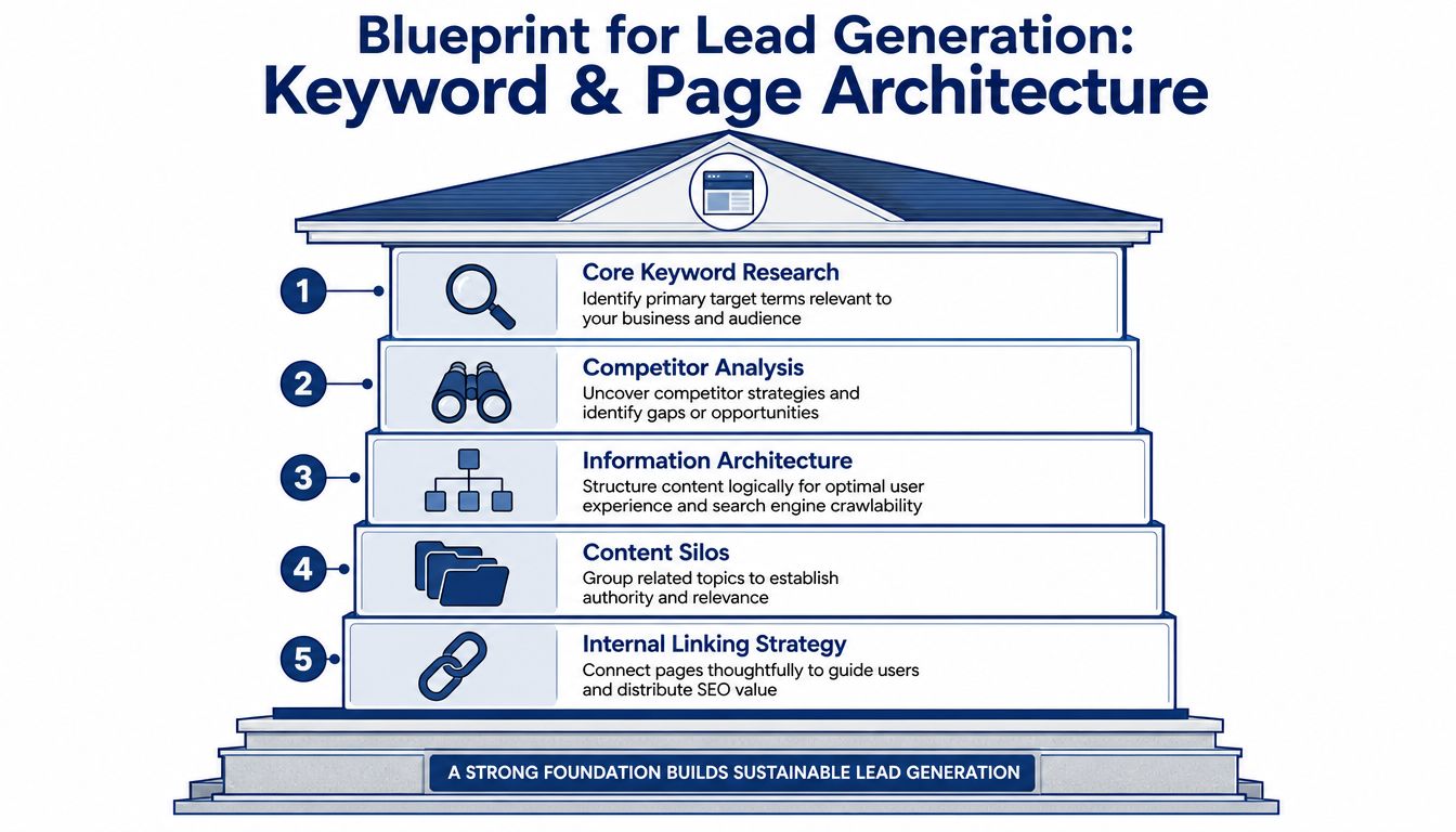
The best-performing websites aren't planned from the menu bar downward. They're built from search behaviour upward. That means looking at what people type into Google, checking what already ranks, and structuring pages around proven demand instead of hopeful guesswork.
A Bristol electrician is a simple example. “Electrician Bristol” is broad. “Emergency electrician Bristol” signals urgency. “Fuse board replacement Bristol” signals a very specific commercial need. Those phrases shouldn't all point to one generic Services page. They need distinct page targets, with wording, headings, and calls to action that suit the problem.
Start with the searches that signal intent
Not every keyword deserves equal attention. Some terms belong near the bottom of the sales funnel. Others belong in educational content.
A sensible split looks like this:
- High-intent service terms: “Emergency electrician Bristol”, “boiler repair Lincoln”, “conveyancing solicitor Manchester”
- Specific problem terms: “consumer unit replacement”, “burst pipe repair”, “commercial lease solicitor”
- Research terms: “why does my fuse board trip”, “how long does conveyancing take”, “signs of a leaking boiler”
The first group needs service and location pages. The third group often belongs in articles that support your main pages through internal linking.
That structure matters commercially. Salesmate's lead generation website analysis states that lead generation websites that implement a reverse-engineered keyword architecture, aligning service page H1 tags and semantic clusters directly with high-intent competitor ranking signals, achieve an average conversion rate of 4.7% for local service businesses, compared to 2.1% for sites using generic template layouts.
Turn keyword research into a sensible sitemap
Once the keyword list is clear, the sitemap usually reveals itself. For a local trades business, that often includes:
- Homepage for the main brand and broad service intent.
- Primary service pages for each money-making service.
- Location pages for the towns or areas you serve.
- Problem-specific pages for urgent or specialist searches.
- Blog or resource pages for common questions and supporting topics.
A Bristol electrician might end up with pages for emergency callouts, rewires, fuse boards, landlord certificates, and separate location relevance where needed. A solicitor might have pages for conveyancing, wills, probate, and family law, then articles answering the questions people ask before they enquire.
If a keyword has clear buying intent, give it a proper page. Don't force five different intentions onto one page and hope Google or your customer sorts it out.
Steal the structure not the copy
Reverse-engineering competitors is a white-hat approach when you use it properly. You're not copying wording. You're identifying what topics, page types, trust elements, and internal links appear again and again across top-performing sites.
That's the bit many businesses miss. They ask a designer for a “modern website” before anyone has mapped the content architecture. Then they wonder why the shiny thing doesn't rank or convert.
Review competitor headings. Look at service page depth. Check whether they use FAQs, review snippets, area references, and clear next steps. Then build something sharper. Better organised. Easier to use. More locally relevant.
If you want a deeper look at that process, lead generation SEO is where the architecture and search intent work really starts paying off.
Designing for Action Not Distraction
Traffic is only half the job. Once a visitor lands on the page, design has to remove friction and point them towards action. Not eventually. Straight away.
Too many service websites still hide the key stuff. Tiny phone number in the top corner. A hero banner with vague copy. A button saying “Learn More” when the visitor wants someone to fix the leak today. That's not user experience. That's digital loitering.

What poor layouts do to good traffic
Take two versions of the same plumbing page.
The weak version has a big stock image, a slogan about “trusted excellence”, and a menu packed with things nobody needs in a hurry. The contact form sits near the bottom. The phone number is visible only if you squint. A customer with a burst pipe leaves because the page feels like work.
The stronger version opens with “Emergency Plumber in Lincolnshire”, shows a call button immediately, lists service areas, includes review proof, and follows with a short form for non-urgent enquiries. That page respects urgency.
UK-based web growth specialists report that service-led businesses lose 40% of leads because their conversion paths don't mirror the specific problem the visitor searched for. That's the keyword-to-CTA mismatch in plain English.
Match the call to action to the search
Calls to action aren't decorations. They're responses to intent.
If someone searches for emergency help, “Call now” is often the right move. If they search for a planned service, “Request a quote” or “Book a survey” may be better. If they're still researching, a softer prompt such as checking availability can work.
Good matching often looks like this:
- Urgent search: “Emergency electrician Bristol” becomes Call now for immediate help
- Planned service search: “Boiler installation Lincoln” becomes Request a boiler quote
- Professional service search: “Conveyancing solicitor Manchester” becomes Speak to a conveyancing specialist
That's far better than slapping “Contact us” on every page and calling it strategy.
Keep forms and contact routes dead simple
Don't ask for a life story on first contact. Most local service forms only need the basics required to start the conversation. If the form is too long, people delay. Then they forget. Then they ring somebody else.
Useful page habits include:
- Sticky contact access: Keep the phone number or main action visible on mobile and desktop.
- Short forms: Ask only for what helps you respond sensibly.
- Repeating the CTA: Place one above the fold and another lower down after proof or service detail.
- Real reassurance nearby: Add short trust cues near the form, such as location coverage or response expectations.
A quick visual breakdown helps if you want to see examples in motion.
Your visitor shouldn't need to think, “What do I do next?” The page should make that painfully obvious, in a good way.
Building Unshakeable Local Trust That Converts
People don't just buy competence. They buy reassurance. That matters even more for local services, where the visitor is often choosing between businesses that look similar at first glance.
Here's the difference in real terms. One business looks polished but generic. The other looks local, reachable, and recognisable. The second one usually gets the enquiry.

One local business looks real and one looks rented
Say you're comparing two accountants in Nottingham.
The first website has slick stock imagery, airy taglines, and not much else near the top of the page. No clear office address. No local references. No visible signs that this firm exists beyond the logo. It feels tidy but oddly anonymous.
The second site shows the office location, a photo of the team, a local phone number, clear service areas, and reviews tied to local clients or towns. It feels grounded. Not flashy. Just believable.
That's not a small detail. Clariant Creative's write-up of Chartered Institute of Marketing data says 68% of UK consumers abandon a lead form if the page lacks visible NAPW consistency, local accreditation logos, or verified Google Business Profile ratings within the first 3 seconds of view.
What local trust signals need to do
Trust signals work best when they answer the doubts in the visitor's head.
Are these people local?”
“Can I contact them?”
“Have they done this for people like me?”
“Will I regret filling in this form?
Practical trust builders include:
- Visible NAPW details: Your name, address, phone, and website details should be consistent and easy to spot.
- Real local imagery: Team photos, vehicles, office fronts, or on-site work in recognisable areas beat generic stock shots every time.
- Accreditations that matter locally: Show the memberships and credentials your customers value.
- Google Business Profile proof: If you've got verified local review strength, surface it where people can see it quickly.
- Location-specific proof for multi-site firms: Different towns need their own local signals, not one generic “we cover the UK” shrug.
A faceless website creates hesitation. A local website lowers risk.
For multi-location SMEs, this gets more nuanced. A single domain can still feel local if each branch or service area page includes the right town-specific proof. That might mean local team references, branch details, area photos, or testimonials that mention the place. Otherwise every page feels cloned, and visitors can smell that a mile off.
The Technical Bits That Make or Break Leads
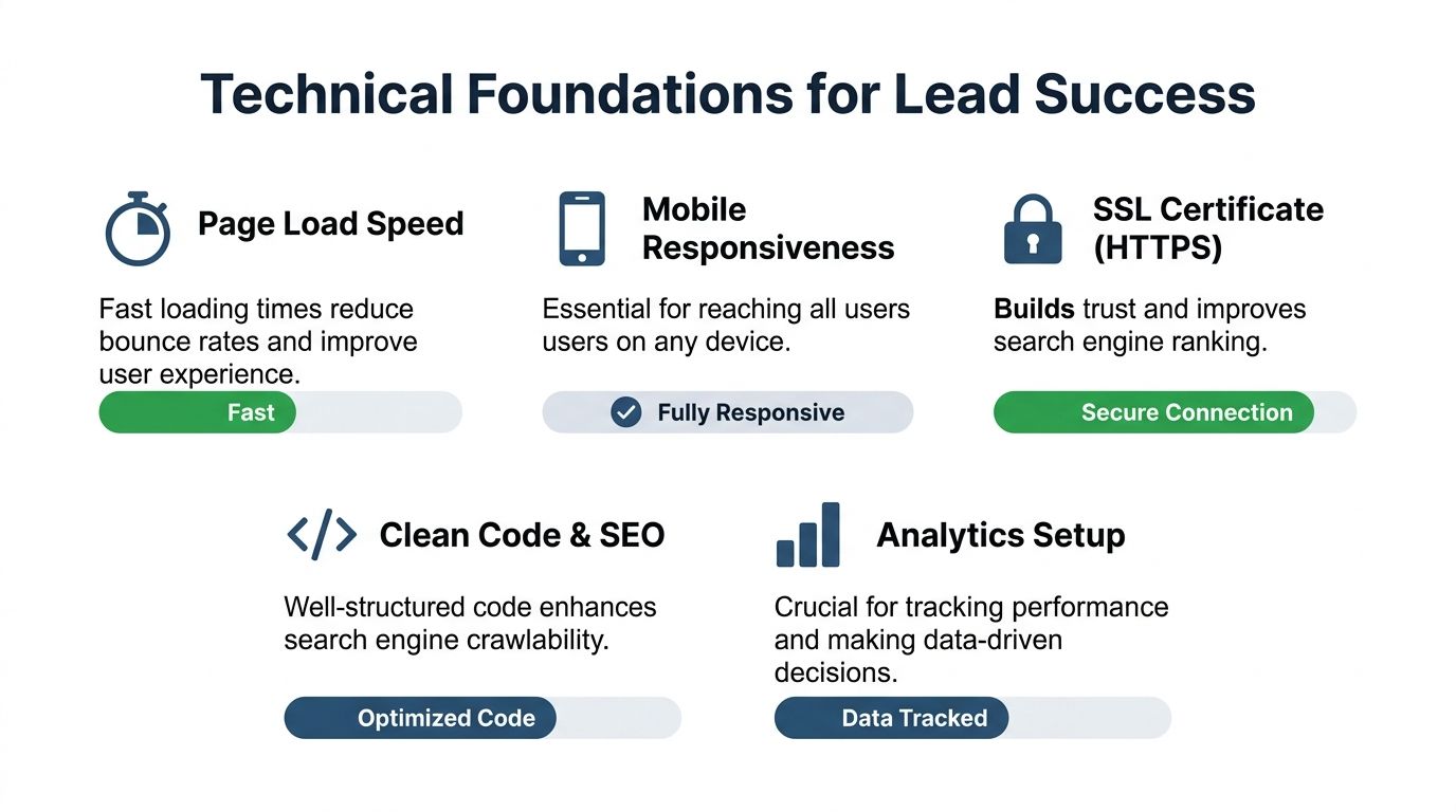
A website can have excellent copy, strong trust signals, and smart page structure, then still lose enquiries because the technical foundations are a mess. Slow load times, poor mobile layouts, broken tracking, and flaky form delivery wreck performance.
This is the part many business owners don't see because it isn't glamorous. No one brags about tidy code over lunch. But technical quality directly affects whether visitors stay, trust the site, and complete the action.
Mobile-first is commercial not cosmetic
A lot of local searches happen on phones, often in moments of urgency. Someone looking for a locksmith, plumber, or solicitor isn't always sat at a desk with time to admire a fancy animation. They want speed, clarity, and one-thumb usability.
That's why mobile-first design matters so much. VWO's web design statistics state that mobile-optimized sites achieve up to 40% higher conversion rates, and 38% of users will immediately abandon a website if they perceive the design as poor. Those are brutal numbers if your business relies on inbound enquiries.
A mobile-ready page needs:
- Tap-friendly buttons: No tiny links designed for ant-sized fingers.
- Readable text: People shouldn't need to pinch and zoom like it's 2011.
- Simple forms: Fewer fields, cleaner spacing, obvious labels.
- Fast access to contact details: Especially for urgent services.
Speed, security and tracking
Page speed affects patience. Security affects trust. Tracking affects decisions.
If a page loads sluggishly, visitors don't wait around out of politeness. They leave. If the site doesn't feel secure, they hesitate before submitting a form. If analytics aren't set up properly, you can't tell which pages generate leads and which ones look busy.
A practical technical checklist usually includes:
- Fast loading pages: Compress media, trim bloat, and keep templates lean.
- HTTPS security: The padlock matters because visitors notice when it's missing.
- Reliable form handling: Test every form and confirmation path properly.
- Analytics and conversion tracking: You need to know which calls to action work.
- Email deliverability checks: A lead form is useless if enquiry notifications never arrive. It's worth running your sending domain through an email blacklist checker from MailGenius if form emails seem to vanish or land unreliably.
One more technical point gets overlooked: local SEO signals and structured implementation should support the site, not sit as an afterthought. When the technical layer is clean, search engines crawl pages more efficiently, users get a smoother experience, and your website design for lead generation has a fair chance to do its job.
Quick Wins and Testing Your Way to More Enquiries
You don't need a full rebuild to improve results. Plenty of local businesses can lift enquiries just by fixing the obvious leaks first, then testing changes instead of guessing.
That's the proper long game. Sort the friction. Observe behaviour. Test one thing at a time. Keep what works. Bin what doesn't. Very British, really. Practical.
Five quick wins you can apply this week
Start with the pages closest to revenue. Usually that means the homepage, top service pages, and your contact page.
- Rewrite weak headlines: Replace vague lines like “Welcome to our company” with plain-English service and location statements.
- Move the CTA higher: Put your phone number, quote button, or enquiry form where visitors see it immediately.
- Add proof near action points: Reviews, accreditations, or local references beside the form help reduce hesitation.
- Tidy the navigation: Remove clutter so visitors don't wander off to irrelevant pages.
- Check every mobile interaction: Test buttons, forms, and click-to-call links on an actual phone, not just on a desktop preview.
One useful habit: Review your own page as if you're a rushed customer. If the next step isn't obvious in seconds, the page needs work.
Simple A-B testing ideas for your service website
You don't need fancy jargon for this. A/B testing means comparing one version against another and measuring which gets more enquiries.
| Element to Test | Version A (Control) | Version B (Variation) | What You're Measuring |
|---|---|---|---|
| Homepage headline | Generic brand statement | Service plus location headline | More calls or form submissions |
| Main CTA button | Contact Us | Get a Quote or Call Now | Click-through to contact action |
| Contact form length | Full multi-field form | Shorter essential-fields form | Completed form submissions |
| Trust placement | Reviews lower on page | Reviews near first CTA | Enquiry rate from the page |
| Service page hero | Stock image only | Real team or local job image | Engagement and enquiries |
Keep the tests simple. Change one main variable at a time. If you alter the headline, button text, image, and form together, you won't know what caused the result.
Why a blog still pulls its weight
Blog content still matters when it supports commercial intent properly. It shouldn't be random opinion pieces or fluffy updates no one asked for. It should answer real customer questions and connect back to service pages.
That matters because Fly High Media's lead generation findings report that in the UK market, websites that include a dedicated blog section generate 67% more leads than those without one. For a local solicitor, that could mean articles about property surveys, probate timelines, or common conveyancing delays. For a heating engineer, it might be guides on boiler pressure, repair decisions, or servicing questions.
A good blog does two jobs at once. It attracts search traffic from question-based searches, and it builds confidence before the visitor reaches out. That's white-hat growth. Useful content, strong relevance, and clear internal links back into your money pages. No gimmicks, no nonsense, and no dabbling in the murkier corners of grey hat or black hat tactics that can leave a business with a short-lived boost and a long-term headache.
If your website looks decent but isn't producing enough calls or enquiries, DigiVisi Ltd builds conversion-focused websites around search intent, competitor analysis, and proper local SEO foundations. The approach is simple. Start with the keywords and page architecture, build for action, add local trust where it counts, and make sure the technical side doesn't let the whole thing down. If you want a site that works harder than a brochure and behaves more like a sales engine, DigiVisi is worth a look.