Skip to content

53% of mobile users abandon a site that takes longer than 3 seconds to load [Google/Think with Google research cited in industry analysis]. For a UK service business, that’s not a vague usability gripe, it’s lost calls, lost quote requests, and lost revenue before the homepage has even finished dragging itself onto the screen.
User experience and SEO are no longer two separate jobs with two separate budgets. Google folded Page Experience into its ranking model in 2021, and the practical meaning is simple, pages that feel slow, awkward, or visually unstable struggle to win both rankings and enquiries [Google Page Experience and Core Web Vitals summary]. If you run a plumbing firm, a solicitor’s practice, or a local electrical business, the site has to be found, trusted, and easy to use in the same breath.
Many owners still treat this like a choice between “making it pretty” and “doing SEO”. That’s nonsense. A page can rank modestly well and still underperform because the form is buried, the phone number is timid, or the content doesn’t match the searcher’s intent. The essential job is to make the site the obvious answer for both Google and the human sitting in a van, on a sofa, or at a kitchen table with a cracked phone screen and limited patience.
For a useful comparison of how search behaviour is changing across engines, LLMrefs has a sharp Perplexity vs Google comparison that helps frame why clarity and usefulness matter more than ever.
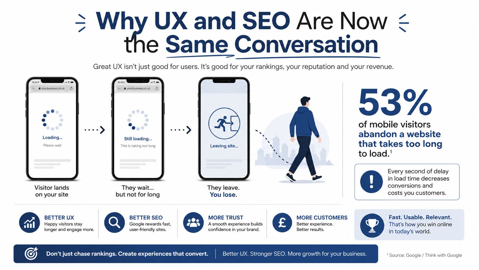
Table of Contents
- Why UX and SEO Are Now the Same Conversation
- How Google Measures a Good Experience
- The UX Signals That Move Rankings and Conversions
- Two UK Service Businesses, Two Very Different Fixes
- The Tactical Playbook for Service Business Sites
- White Hat Fixes Versus Grey Hat Shortcuts
- Your 30 and 90 Day UX-SEO Checklist
Why UX and SEO Are Now the Same Conversation
A slow mobile site is a commercial problem before it is a design problem. If the page is taking too long to load, the visitor is already halfway back to Google, and that is especially true on local service sites where the primary job is to get someone to call, book, or request a quote. A Bristol plumber with a clunky mobile homepage does not just irritate people, he loses the job to the firm that answers the query cleanly and quickly.
The split between SEO and UX never really held up for long. One page has to satisfy the search engine and the person using it. Google’s Page Experience update made that relationship harder to ignore, because a result that loads badly, shifts around, or frustrates the user is a poor result however tidy the title tag looks [Page Experience and Core Web Vitals explanation].
That matters most for local service firms, because the customer journey is short and impatient. Someone searches, scans a few results, taps one page, and decides whether to call or bounce. If the page feels flimsy, they do not sit there writing feedback like a Victorian critic. They go back to the results and pick the next firm in line.
Practical rule: If a page cannot earn trust in a few seconds on mobile, it is failing at both UX and SEO.
The better way to think about it is simple. SEO gets people in the door. UX keeps them there long enough to convert. For a trades business, that conversion might be a call. For a solicitor, it might be a form submission or a consultation booking. For a local clinic, it might be an appointment request. The page still has to do both jobs properly.
I spend a lot of time looking at service sites that have been redesigned for appearance and barely moved for enquiries. The problem is usually ordinary, which is why it gets missed. The wrong section is too prominent, the content misses local intent, or the page loads like it is being carried uphill in clogs. That is why I treat user experience and SEO as one discipline for local sites, not two separate ones with separate excuses.
The same practical view applies beyond traditional search. If a user compares a business page with a Perplexity vs Google comparison, the page still has to load fast, read clearly, and answer the intent without friction. Search behaviour may shift, but weak UX still gives people a reason to leave.

How Google Measures a Good Experience
Google doesn’t measure “niceness”, despite what some pitch decks seem to imply. It measures signals that stand in for a good experience, then uses those signals alongside relevance and authority checks. For a small business, a key question is whether the page loads cleanly, responds quickly, and stays visually stable while people are trying to use it [Page Experience and Core Web Vitals explanation].
The three metrics that matter in plain English
Largest Contentful Paint, or LCP, is the moment the main part of the page appears. It is comparable to a shop window finally showing the item a customer came to see. Google’s published benchmark is under 2.5 seconds. If the main content is still loading while the visitor is staring at a spinner, the page starts on the back foot.
Interaction to Next Paint, or INP, measures how quickly the page reacts when someone taps or clicks. The current benchmark is under 200 milliseconds. For a service business, that is the difference between a button that feels responsive and a form that feels like it is ignoring the customer. Google moved away from First Input Delay toward INP in its page experience framework, so the focus is now on real responsiveness in normal use.
Cumulative Layout Shift, or CLS, tracks visual wobble. The benchmark is under 0.1. If the price jumps, the button moves, or the form field slides just as someone goes to click, the page becomes a nuisance. On a quote page, that kind of movement is enough to dent trust.
A page doesn’t need to be clever. It needs to be steady, quick, and obvious.
There’s a useful split between lab data and field data, and most site audits are only honest when they use both. Lab tests show what a page should do in controlled conditions, while field data shows what real visitors experience on real devices, on real connections, at real times of day. That lab vs field data approach matters for local firms because a page that looks fine in the office can still feel slow on a rainy high street with weak signal and a tired phone.
A conveyancing site that loads its hero image before the call-to-action, or a solicitor’s page that shifts once the trust badges appear, is not just dealing with a technical annoyance. It is creating friction at the exact moment someone is deciding whether to stay. When Google sees that kind of pattern, the page is less likely to win the click and keep it.

The UX Signals That Move Rankings and Conversions
Most local sites do not need a grand UX strategy. They need a short list of signals that move performance, then the discipline to stop wasting time on theatre. I’d split those signals into two buckets, search-side and conversion-side, because they do not always pull in the same direction, and a practical audit has to decide which one is holding the site back first.
Search-side signals that deserve priority
Page speed comes first because it affects whether the page gets a fair hearing at all. Google has stated that 53% of mobile users abandon sites that take longer than 3 seconds to load [Google/Think with Google research cited in industry analysis]. That is brutal for local service pages, where the user often only wants one thing, a direct path to contact.
Mobile usability is next. UK-focused SEO summaries note that 70% of mobile searches are local and 46% have local intent. That makes the mobile version of the site the version that matters most. A mobile-first design can achieve 20% higher organic CTR, which is the sort of lift that comes from being easier to tap, scan, and trust.
Internal linking and content layout matter because they help both users and Google understand what each page is for. If the service pages are isolated islands, authority and clarity do not flow where they should. If the layout buries the answer under a wall of intro text, the user does what users always do, they skim, grumble, and leave.
For businesses in India applying the same principles, Techfusion Gear’s SEO services in Ahmedabad cover technical SEO, on-page optimisation, local visibility and service-page improvements.
Conversion-side signals that pay the bills
Trust is where a lot of sites leak enquiries. The same UK-oriented source reports that a 4.5+ star Google rating increases local search visibility by 35%. That is not magic, it is credibility showing up in the search results and on the page itself.
A clean click-to-call action, a sensible form, and obvious opening hours are the boring details that convert. They matter more than fashionable animations or a heroic homepage video. I would rather see one clear primary action above the fold than a carousel full of self-importance.
Prioritisation rule: fix pages that already have impressions but weak engagement before you chase new content ideas.
That approach is especially important for local firms with limited budgets. If a page already shows up in Search Console but gets poor clicks or weak engagement, the problem is usually intent mismatch, friction, or weak presentation, not a lack of keyword volume. For a structured look at the conversion side of this work, improve conversion rate with Chatgrow is worth a skim, especially if you are trying to separate cosmetic changes from real behavioural fixes.
For teams that need the technical and conversion layers brought together, DigiVisi Ltd offers service page optimisation, internal linking, schema work, and technical SEO audit work as part of its UK service-led SEO approach. For a conversion rate optimisation consultant to look at the rest of the funnel as well, that is the sort of joined-up work that stops good traffic being wasted. The point is not decoration, it is making the page easier to find and easier to use.
Two UK Service Businesses, Two Very Different Fixes
A Bristol electrician I’d look at first might have a decent mobile homepage, fast enough and readable enough, but the enquiry flow is a mess. The quote form sits below a chunky stock image, the service pages are light on local detail, and the call-to-action feels like it’s been added as an afterthought by someone who’d rather be anywhere else. The ranking issue isn’t necessarily the homepage, it’s the service pages failing to turn interest into contact.
A Manchester solicitors firm can have the opposite problem. The design looks polished, the tone is professional, and the layout feels calm. Yet the mobile site is slow, the local schema is missing, and competing firms with less handsome pages still outrank them for searches like “solicitors near me” because the technical and local signals are weaker.
Same discipline, different bottleneck
The electrician needs conversion-first work. The legal firm needs search-first work. Both need the same discipline, but the order of attack is different. That’s the bit too many generic UX audits miss, because they list “improve usability” without asking where the site is leaking value.
For the electrician, I’d start with the form, the click-to-call placement, and the service page layout. If the page already gets traffic, the priority is removing friction after the click. For the solicitor, I’d start with mobile performance, structured data, and local relevance, because the issue is discoverability before persuasion.
A good rule is to inspect the page that already has impressions but weak engagement, then ask whether the problem is the wrong promise, the wrong layout, or too much faff between interest and action. That’s usually more useful than reworking every page in sight because the redesign brief looked a bit thin.
The charm of local SEO is that it’s brutally honest. If the page is slow, vague, or awkward on mobile, the market tells you quickly. Not in a dramatic way, just in the quiet absence of enquiries, which is far less glamorous and much more expensive.
The Tactical Playbook for Service Business Sites
The strongest fixes are rarely glamorous, but they stack up. For a small UK service business, I’d order the work like this, performance first, then structure, then conversion clarity, then trust signals. That keeps you from polishing a page that still loads like a wheelbarrow full of bricks.
Start with the bits users feel
Site speed comes first. If you’re stuck with a modest hosting budget, don’t expect miracles from cheap infrastructure and five different sliders. The quickest wins are often image compression, script trimming, and cutting excess page bloat before you touch the shiny bits. Google’s published thresholds for LCP under 2.5 seconds, INP under 200 milliseconds, and CLS under 0.1 give you a concrete target rather than a vague instruction to make it faster.
Navigation depth should stay shallow enough that a visitor can reach the main service pages without a small expedition. Breadcrumbs help both the user and the crawler understand where they are, especially on multi-service sites. If the path to a key page feels like wandering around a warehouse with no signs, the structure needs a rethink.
Mobile UX needs special attention because that is where local intent lives. Tap targets should be large enough to hit cleanly, the call-to-action should be obvious, and the sticky phone button should behave like a useful shortcut rather than an intrusive nuisance. If a visitor has to zoom to use the site, the site is already working against itself.
Make the page do a smaller job more cleanly
Form friction is where enquiries die. Shorter forms usually beat clever forms, especially on mobile. Ask only for the details you need at first contact, because every extra field is another excuse to leave.
Internal linking should connect related services, locations, and supporting content so each page earns context. If the site covers boiler repair, emergency call-outs, and landlord checks, those pages should speak to one another naturally. That helps users browse in a sensible way and helps search engines see the topical relationships.
Schema markup for LocalBusiness, Service, and useful FAQ content makes the page easier to interpret. It will not rescue a weak site on its own, but it supports the clarity you want everywhere else. The same applies to accessibility basics such as proper heading order, keyboard navigation, and usable tap targets, because they improve both task completion and the quality of interaction signals.
If the page is built for a mouse pointer and a designer’s ego, it is not built for the people who call the business.
For a no-nonsense local audit of crawlability, headings, structured data, speed, Core Web Vitals, and internal links, DigiVisi Ltd’s technical SEO audit and service page optimisation work fit neatly into this sort of prioritised clean-up. It is not about slapping more content on top, it is about making the current site do its job better.
White Hat Fixes Versus Grey Hat Shortcuts
There’s a lot of nonsense sold as UX work because it sounds respectable and the client can’t easily see the difference. Effective UX-SEO work improves how people move through the site, how quickly they find what they need, and how confidently they can take the next step. Grey-hat stuff often looks clever in a deck and wobbly in practice.
What genuine work looks like
White-hat UX-SEO usually involves user testing, page speed fixes, layout rewrites, schema implementation, and changes made because the page failed real users. It’s measurable in a sensible way. You can watch a form stop being abandoned, or see a key page become easier to understand on mobile. That kind of work compounds because it’s rooted in the actual behaviour of visitors.
Grey-hat tactics often pretend to be optimisation while chasing a short-term behavioural signal. Aggressive interstitials, cloaked mobile content, and manufactured review activity can produce a brief bump, then cause a mess when the page experience or helpful-content side of the algorithm catches up. That’s not strategy, it’s a quick sandwich before the food inspector arrives.
A simple test for any recommendation
Ask two questions before signing off on a UX-SEO change.
- Does this help a real visitor complete a task? If the answer is no, it’s probably theatre.
- Would I be comfortable showing Google exactly how this works? If the answer is no, it’s probably too clever by half.
The white, grey, and black hat distinctions still matter. White hat work aligns the business with the user and the search engine. Grey hat work tries to dress up manipulation as improvement. Black hat work just lies and hopes nobody notices, which is a bold strategy for anyone whose income depends on trust.
The best sites don’t look dramatic in a meeting. They feel obvious to use, easy to trust, and hard to beat because the basics have been done properly. That’s the unglamorous truth, and it’s why so many “sexy” shortcuts age like milk.
Your 30 and 90 Day UX-SEO Checklist
Start with the jobs that tell you whether the site is helping or hindering. In the first 30 days, check mobile Core Web Vitals, lift the click-to-call above the fold on every service page, tighten title tags and H1s around local intent, and add LocalBusiness and Service schema. Those four actions give you a quick read on whether the site is structurally sound or just aesthetically polite.
A practical 30 day sprint
- Measure mobile performance first. Look at the site the way a customer does, on a phone, not a monitor in the office.
- Make contact obvious. The phone number and primary call-to-action should not require a treasure hunt.
- Align page headings with local intent. If the page is about emergency boiler repair in one town, say so cleanly.
- Add the structured data. It supports clarity for search engines and helps local business information sit in the right place.
By day 90, move into internal linking, content layout, and review generation tied to completed jobs. That’s where the site starts behaving more like a system than a set of isolated pages. The review piece matters because trust isn’t an optional extra in local search, it’s part of how people decide whom to contact.
Track the work in Google Search Console and Looker Studio using mobile LCP, branded versus non-branded impressions, click-to-call events, and form completions. If the site is improving, those signals should tell the story without much argument. If they don’t, the page still has a bottleneck somewhere, and it’s better to find it now than after another quarter of wishful thinking.
If you want a local SEO plan that treats user experience and SEO as one commercial system, DigiVisi Ltd builds around technical audits, service page optimisation, internal linking, schema, and conversion-ready site structure for UK service businesses. Visit DigiVisi Ltd to see how that approach could fit your site, your market, and the leads you want.