Skip to content

You can spend a small fortune on a sleek new website, wait for the phones to ring, and end up staring at a silent desk while the kettle gets more action than your enquiry form. That's the awkward truth for plenty of UK plumbers, solicitors, roofers, and other service businesses, the site looks polished, but it doesn't do anything. Conversion focused web design fixes that by treating the page like a sales tool, not a digital brochure.
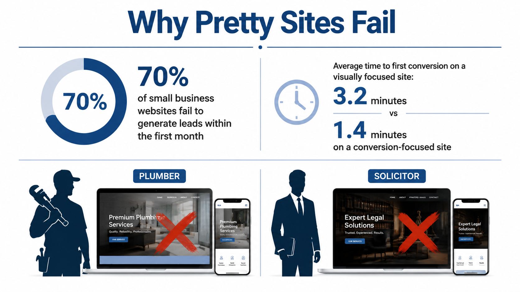
Table of Contents
- Why a Pretty Website Still Fails to Convert
- Defining Conversion Focused Web Design Properly
- The Mechanics That Move the Needle
- Implementing It for a UK Local Service Business
- White Hat, Grey Hat and Black Hat Conversion Tactics
- Measuring Conversion Lift Without the Cookies You Used to Have
- A Prioritised Conversion Checklist for This Week
- Connecting Conversions to SEO and Google Business Profile
Why a Pretty Website Still Fails to Convert
A Leeds plumber once came to me with a site that looked brilliant on a laptop. Big hero image, tasteful icons, the lot, very “design award shortlist”, very little “please call me now”. The problem wasn't the look, it was the page's job. It tried to impress everyone, which meant it persuaded no one.
That's the trap. A visually polished site can still underperform if it buries the phone number, scatters attention across too many buttons, or sends visitors wandering through a mini brand museum before they reach a contact point. Conversion focused web design is commercial design. It asks a simple question, what does this visitor need to do next, and how quickly can the page get them there?
The gap between style and performance is obvious in benchmark data. The median general website conversion rate is 2.35%, while dedicated landing pages convert at 4.02% median and the top quartile exceeds 11.45% (benchmark data). A page with a single CTA convert 32% better than pages with two or more CTAs, which is exactly why “more options” often means less action (benchmark data).
A site doesn't need to be loud. It needs to be obvious.
For a Bristol solicitor, that might mean one clear route to book a consultation, not a carousel of competing promises. For a boiler engineer, it might mean a phone number, service area, and emergency message above the fold, not a poetic ode to craftsmanship. The rest of this guide is about moving from “looks decent” to “brings in enquiries without the site owner having to perform wizardry before breakfast”.
Defining Conversion Focused Web Design Properly
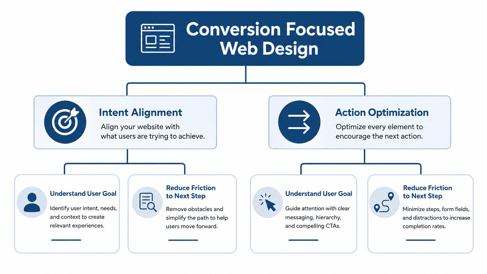
Conversion focused web design means every visible choice on the page earns its place by helping a user take the next sensible step. That's different from generic UX, which can aim for comfort, clarity, or broad satisfaction without necessarily pushing action. A site can be pleasant to use and still fail to create leads, which is a bit like building a lovely shop with no till.
Five principles that matter on UK service sites
1. Intent alignment. A person searching “emergency plumber Leeds” doesn't want a brand story, they want reassurance, speed, and a way to call now. The page should match the searcher's job to be done, not wander off into corporate autobiography.
2. One primary action. If the page wants a call, make the call the obvious next step. If it wants a quote, put that route front and centre. Multiple equal choices tend to weaken commitment.
3. Friction reduction. Every extra field, click, or unnecessary paragraph adds resistance. A boiler repair form asking for name, phone, postcode, and the problem is easier to complete than one that behaves like a tax return.
4. Trust building. People need proof before they hand over details. For a local accountant in Manchester, that might mean visible business identity, privacy wording near the form, and clear service information.
5. Mobile-first structure. On a phone, the page has to work with thumbs, not a mouse. Phone number, opening hours, and the contact action need to be easy to tap without squinting like you're reading a bus timetable in fog.
A useful reference point for broader CRO thinking is Solo AI's guide to CRO in 2026, especially if you want the wider terminology around testing and optimisation. But for UK local services, the definition stays practical, align intent, reduce friction, and make the next action impossible to miss.
The Mechanics That Move the Needle
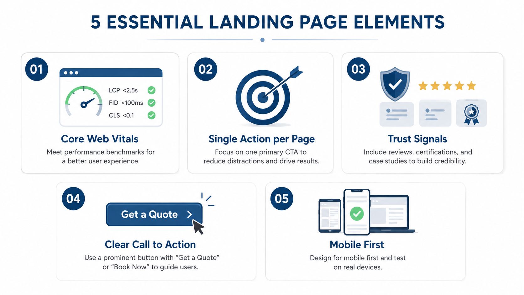
A fast page is part of the conversion path, not a nice extra. The UK Office for National Statistics reported that 25% of UK businesses made web sales in 2024, up from 23% in 2023, so the website still does commercial work, including for businesses that close leads by phone (ONS 2024 web sales). Benchmarking also shows that each extra second of load time costs about 0.3% in conversions, and pages slower than 3 seconds lose around 40% of visitors (performance benchmark data). For a Birmingham roofer, that means missed calls because the page took too long to become usable.
Where the page loses enquiries
Core Web Vitals in practice. Field data matters more than a tidy lab score. Watch how the page behaves for actual users, then fix LCP, CLS, and INP regressions before they spoil the first usable moment. Preloading fonts and hero images helps because it reduces render-blocking and layout wobble.
Single-action layout. The page should have one main path. A Manchester accountancy firm does not need three different “contact us” variants competing for attention. One clear enquiry route keeps the page focused.
Form friction. Even a short form can feel long if the labels are clunky or the page makes people work for reassurance. Remove fields that do not help qualification. A call-first trade business often needs less data on the page and more clarity about what happens next.
Trust signals. Reviews, service details, and clear business identity should sit close to the action. That matters for visitors who are cautious about sharing personal details, or who have been burned by vague sites before. Good trust cues are quiet, not shouty.
Mobile usability. Ofcom says around 88% of UK adults used a smartphone in 2024, so the default experience needs to be thumb-friendly and readable on a small screen (Ofcom smartphone use). If the button is hard to tap, the enquiry dies before it starts.
A practical check is to check readability in web fonts with Font before you settle on typography. A font choice can support action or get in the way of it.
Practical rule: if the user came to call, the page should help them call. If it makes them think too hard, it is already losing.
Implementing It for a UK Local Service Business
For a small firm, the job is not to redesign everything at once. It is to make the site make sense by service, by location, and by user intent, without turning it into a spaghetti bowl of duplicated pages and hopeful buttons. A three-area service business needs different paths for a phone call, a quote request, and a branch visit, but those paths still need to feel like one site.
Start with the page map
Begin with keyword architecture. Group search terms by service and place, then map each group to a page that answers one clear need. A solicitor in Bristol should not force “family law” and “conveyancing” into one catch-all page if the intent is different. A multi-location trades firm should not make all branch pages look identical except for the town name either.
Next, align Google Business Profile entries with the site's structure. If the site says one thing and the profile says another, users get wary, and Google gets mixed signals. Keep NAP details clean, use the right categories, and make sure opening hours and contact routes reflect the actual local setup.
If a branch takes calls differently from a head office, say so plainly. Confusion near the contact point costs more than a slightly longer page ever will.
Then add the technical pieces that support trust and discovery. Schema markup helps search engines interpret the business, the service, and the location context. Internal links should point users from service pages to relevant location pages, guiding them to relevant next steps instead of sending them back to the homepage like a confused receptionist.
The sequencing matters too. Fix the page structure first, then write the copy, then tighten the technical performance. If you reverse that order, you end up polishing sentences on a page that still loads like it is on a dial-up comeback tour.
For smaller teams, a specialist workflow can help. DigiVisi Ltd, for example, builds site structure around keyword architecture and conversion-ready page logic, then layers in local SEO and technical fixes. That is useful when you need the site to support calls and enquiries, and to fit how the branch does things, rather than sit there looking respectable in Chrome.
White Hat, Grey Hat and Black Hat Conversion Tactics
A call-heavy local site lives or dies on trust. White hat conversion tactics keep that trust intact because they are honest, useful, and grounded in how the business operates. A genuine urgency cue, such as “same-day call-backs where available”, works because it reflects an actual process. A transparent privacy note near the form does the same job, since it tells people what happens to their details before they decide to call or enquire.
Grey hat tactics sit in a messy middle that a lot of conversion guides gloss over. A countdown timer on a standard service page can be harmless if it is tied to an actual process, but it turns questionable when it resets for every visitor and pretends scarcity that does not exist. Social proof sits in the same territory. Real customer feedback is fair game, while vague praise with no context starts to feel slippery, especially on higher-stakes pages like solicitors, medical, or trades work.
Black hat is where trust gets mugged in an alley. Hidden pre-ticked consent boxes, fake testimonials, fabricated “limited slots”, and misleading buttons that do one thing but imply another all fall into that category. They may squeeze a few more clicks out of a page for a while, but they also teach people not to believe you.
A Bristol solicitor can say “book a consultation” and show actual client reviews near the form. They can also keep the privacy notice clear and focused squarely on the user's immediate need. What they cannot do is invent urgency around legal availability or bury the privacy notice under a footer maze and pretend that counts as consent. That is not clever conversion work, it is just a quick route to looking like a chancer in a nice shirt.
The best sustained gains usually come from sharper targeting, faster pages, and clearer offers. Dark patterns create the appearance of performance by forcing the click, then damaging trust after the click. For any UK service business that depends on reputation and repeat referrals, that is a poor trade.
Measuring Conversion Lift Without the Cookies You Used to Have
If a redesign drives more calls, you need a way to prove it without pretending the old analytics world still behaves neatly. Consent rules, browser restrictions, cross-device journeys, and phone-led enquiries all make the picture messier than a neat ecommerce dashboard. That doesn't make measurement impossible, it just means the stack has to be more honest.
Use the right signals
Start with field data, not vanity metrics. Core Web Vitals in the wild tell you how the page performs for actual users, which is more useful than a perfect test environment. Then add call tracking for phone-led businesses, because many local conversions never touch a neat form thank-you page.
Form analytics helps too. Track where people abandon the form, which field causes friction, and whether mobile visitors drop off faster than desktop users. If your enquiry form has four fields and people still abandon it, the issue might be wording, reassurance, or layout, not just length.
Practical rule: measure the action you actually want, not the one that's easiest to count.
For service businesses, that often means a combined view of calls, forms, booking requests, and quote submissions. A bedroom-fitters site and a law firm site won't convert in the same way, so the dashboard shouldn't pretend they do. If you report accurately, you'll also avoid the usual agency party trick of celebrating traffic while the phone remains mute.
A privacy-conscious setup can still be useful if it's built around consent-aware analytics and careful source grouping. The point isn't to resurrect old tracking habits with a disguise on. It's to see enough of the customer journey to understand what changed after the redesign and whether the business got more qualified enquiries, not just more clicks from curious browsers.
A Prioritised Conversion Checklist for This Week
If the budget's tight, start with the fixes that remove friction fastest. The homepage and core service pages should make the phone number, primary CTA, and trust cues impossible to miss. After that, clean up the enquiry form so it asks only for what the team needs.
Quick wins first
- Make the primary action obvious: One main CTA per page, with wording that matches the service, such as “Get a Quote” or “Book a Call”.
- Move the contact details up: Phone number, hours, and location need to be visible without a treasure hunt.
- Trim unnecessary form fields: If a field doesn't help the team respond better, it's probably adding friction.
- Check mobile spacing: Buttons need enough room for real thumbs, not a surgeon's precision.
- Add trust near the action: Reviews, business identity, and privacy reassurance should sit close to the form or call button.
Bigger jobs next
- Split pages by service and location: Don't force different intents into one page.
- Align GBP and site copy: Names, categories, opening hours, and service areas should match.
- Fix page speed issues: Especially above-the-fold images, fonts, and layout shifts.
- Review internal linking: Service pages should guide users to the right next step without distraction.
| Tactic | Expected Impact | Effort | Owner |
|---|---|---|---|
| Make one primary CTA obvious | High | Low | Marketer |
| Trim enquiry form fields | High | Low | Owner and Marketer |
| Improve mobile tap targets | High | Medium | Developer |
| Align service and location pages | High | Medium | Marketer |
| Fix Core Web Vitals regressions | High | High | Developer |
If there's one thing to ignore this week, it's decorative redesign work that doesn't affect action. A prettier hero section won't rescue a muddled offer, and a shinier icon set won't fix a page with no clear path to contact.
Connecting Conversions to SEO and Google Business Profile
Search intent, on-page structure, and Google Business Profile need to tell the same story. If someone lands from a local search, the page has to answer the specific service query quickly, then make the next step obvious. That's true whether the visitor came from a standard organic result, a map result, or an AI-assisted summary.
A helpful follow-on is DigiVisi's small business local SEO guide, because the conversion layer works best when it sits on top of clean local visibility. For phone-led businesses, pairing that with a sensible call system matters too, so HubSpot phone system costs and features is worth reviewing if you're thinking about how enquiries get routed after the click.
Three questions usually come up once the new design is live. First, are people finding the right page for the right intent? Second, are calls and forms being counted cleanly? Third, is the site matching what the GBP listing promises? If any of those answers are fuzzy, the next iteration should be about clarity, not more visual fuss.
The practical aim stays simple. Build pages that match search intent, keep the route to enquiry short, and monitor what happens after the visitor arrives. That's how SEO, GBP, and conversion design stop behaving like separate departments and start acting like one revenue system.
If you want your site to bring in more calls instead of just looking polished, DigiVisi Ltd builds conversion-ready websites and local SEO systems around real keyword intent, service pages, and Google Business Profile alignment. Visit DigiVisi Ltd to see how their approach can turn more of your existing traffic into enquiries, bookings, and proper business, not just another pretty homepage.